Matt, the first-timer
Explore a first volunteer opportunity
Browse complete opportunities before creating an account, then understand the schedule, expectations, and commitment.
Path: Browse opportunities
Pittsburgh Cares
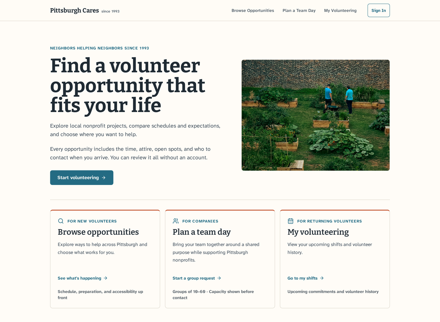
I redesigned Pittsburgh Cares to make volunteer opportunities easier to find, understand, and act on. The result is a clearer path from interest to participation.
01 · Project overview
Volunteers couldn't see what was available or what it involved, and group organizers couldn't tell whether a host had room for them before reaching out.
I audited the live site, held three contextual conversations, and designed the information architecture and interface. I tested the prototype with five participants, then retested the group flow with two.
Three paths matched to what people came to do, with no account needed to browse. Group booking was the hardest task at 3.0/5; after three fixes, both retest participants rated it 5/5.
Initial ease ratings (average of 5)
Group-booking retest after three fixes (n=2)
02 · Understanding the problem
Pittsburgh Cares connects people and organizations with volunteer opportunities across the region. As a designer based in Pittsburgh, I chose to examine how someone ready to help would find a suitable opportunity and understand what to do next.
I reviewed the live site as a new volunteer and as a group organizer: how opportunities were presented, where each path led, and what information was available before someone committed.
Original Pittsburgh Cares website
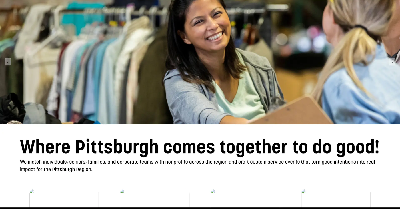
The route to browsing opportunities appears farther down the page; see the "Before click" image in the next pair.
Original Pittsburgh Cares website
Before click
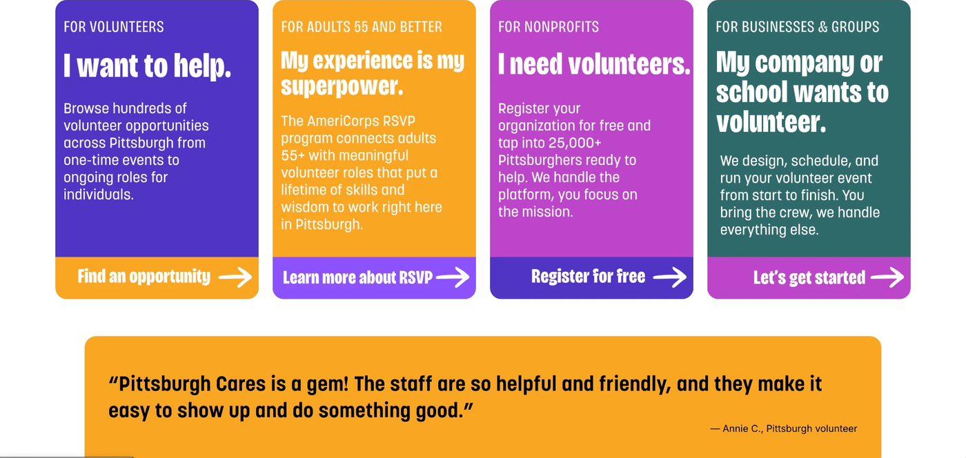
After click
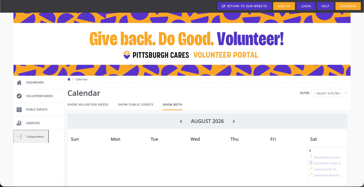
Before click: the volunteer entry-point cards, including Find an opportunity, sit farther down the original homepage.
Competitive audit
| Platform | Location / distance filter | Date / availability filter | In-person vs. virtual | Open capacity shown | What-to-expect details | Group coordination |
|---|---|---|---|---|---|---|
  | Yes | Not observed | Yes | Not observed | Not observed | Not observed |
 | Yes | Yes | Not observed | Not observed | Not observed | Not observed |
 | Not observed | Not observed | Not observed | Yes | Yes | Not observed |
 | Not observed | Yes | Not observed | Not observed | Not observed | Partial |
Four directions I took into the redesign:
03 · Defining the direction
These proto-personas came from the audit and research above. They are working hypotheses, not validated user segments.
This redesign focuses on individual and group volunteers. Tools for nonprofit partners were out of scope, and older volunteers are represented by Emma, the recurring senior volunteer.
Matt, the first-timer
Browse complete opportunities before creating an account, then understand the schedule, expectations, and commitment.
Path: Browse opportunities
Brooke, the corporate team organizer
Confirm that a host can support the group size, dates, logistics, and accessibility needs before sharing contact details.
Path: Plan a team day
Emma, the recurring senior volunteer
Reach upcoming shifts, reconfirm, check in, or cancel without repeating discovery and registration steps.
Path: My volunteering
Central design question
How might we design distinct paths through Pittsburgh Cares so each audience reaches what they need without friction meant for someone else?
Design priorities
Primary journey · Proto-persona 1
Matt, our first-time volunteer, wanted a Saturday opportunity and enough information to decide whether it fit.
Original site
Emotion: medium-high
Sees a post about a food drive and decides this is the weekend he finally does something.
Redesign direction: Meet intent immediately with real, dated opportunities on the landing page.
Original site
Emotion: low
Selects the volunteer path and arrives at a separately branded portal with Sign up and Login controls alongside the opportunity calendar.
Redesign direction: Keep opportunity browsing within the main experience and show available shifts before presenting account actions.
Original site
Emotion: medium-low
Finds one listing that looks plausible but can't tell what to wear, how physical it is, or who else will be there.
Redesign direction: A “What to expect” strip: dress code, activity level, group size, who you'll work alongside.
With the redesign
Emotion: medium-high
Gives name, email, and a time slot, then taps “Register as a guest”.
Redesign direction: Keep the ask lightweight: an RSVP, not an application.
With the redesign
Emotion: high
Arrives Saturday morning, finds the check-in table, gets a task in under five minutes.
Redesign direction: Repeat the what-to-expect details in the confirmation so it's on his phone at the door.
With the redesign
Emotion: high
Leaves feeling useful and open to a second shift.
Redesign direction: Offer one nearby next shift, not a newsletter subscription.
04 · Designing the experience
Each path matches how much structure the task needs.
| Finding | Evidence (where it came from) | Design decision |
|---|---|---|
| Nine-slide rotating carousel filled the first view and moved content before people finished reading | Original homepage audit + heuristic review (User control and freedom) | Three intent-based path cards on the homepage, real dated opportunities up front |
| “Find an opportunity” sent volunteers to a separately branded Galaxy Digital portal with Sign up and Login in the header | Calendar handoff audit + heuristic review (Visibility of system status) | Browsing stays in the main experience, no account needed; guest registration (name, email, shift time) |
| Statistics, labels and headings were embedded in images | Heuristic review (Accessibility: images of text) | |
| No filtering by date, cause, format, distance or commitment | Heuristic review (Flexibility and efficiency of use) | Filters for ZIP, distance, cause, date, format, open spots |
| Matt couldn’t tell dress, physical demands or who else attends | Matt’s journey, stage 3 | “What to expect” strip: dress code, activity level, group size, co-workers |
| Group organizers couldn’t tell if a host had room before reaching out | Problem statement, Brooke proto-persona | “Hosts with capacity” step; capacity shown before contact details |
| Competitors handled discovery; only Points of Light Engage offered even partial group coordination | Competitive audit | A dedicated “Plan a team day” path |
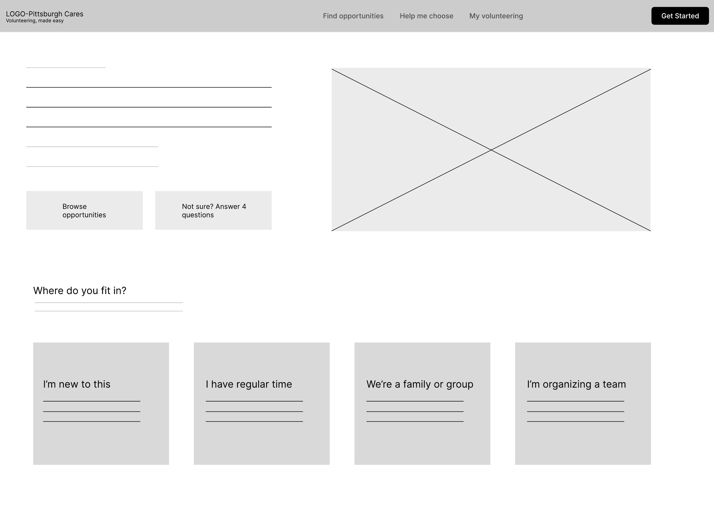
| Early wireframe had four entry paths and a four-question quiz | Selected wireframe | Three paths; quiz became the lighter “Help me choose” panel |
The first-timer
Home
Has a free Saturday and selects Browse opportunities.
Browse opportunities
Filters six listings and selects View details.
Opportunity detail
Reviews expectations, access, contact, and tips.
Sounds doable?
Yes fill in the guest form.
No back to Browse opportunities.
Register
Enters name, email, and time slot, then selects Register as a guest and sees "You're registered."
The corporate team organizer
Home
Needs a volunteer day for 10–60 people and selects Plan a team day.
Your request
Enters headcount, dates, cause, setting, and access needs, then selects Find matching hosts.
Hosts with capacity
Compares viable and undersized options.
A host fits the request?
Yes review this host.
No back to Your request.
Review and contact details
Adds organizer details, consents to contact, and submits the team-day request.
Request received
Pittsburgh Cares and the selected host review the request. Capacity remains pending until the host approves it.
The recurring senior volunteer
My volunteering
Opens it from the persistent navigation.
Email lookup
Selects Send me my link, then Open my shifts.
Upcoming shifts
Sees upcoming shifts and hours logged.
Needs reconfirmation?
Yes Reconfirm this shift, then see "Confirmed. Nothing else to do."
No keep current status.
Supporting structure
Each audience's path is reachable from the persistent navigation, not only from Home.
Matt's path
Brooke's path
Emma's path
Shared
Shared
Home, with five sections:
Selected wireframe
05 · Testing and iteration
Five participants completed initial moderated testing on the prototype. In those sessions, participants completed the first-time browsing task and the returning-volunteer task successfully; group booking produced the most friction. Two of the five participants returned for retests limited to the group-booking task.
Ease ratings are post-task self-reports on a 1–5 scale, where 5 is very easy. Scores are averages across the five initial sessions.
01
First-time volunteer (persona: Matt)
4.8/5Performed well in the initial sessions.
02
Corporate organizer (persona: Brooke)
3.0/5The most friction of the study, and the source of nearly every logged issue.
Both participants who returned for the retest, after three fixes.
| Participant | Before | After |
|---|---|---|
| Silas | 4/5 | 5/5 |
| Sheila | 2/5 | 5/5 |
03
Returning volunteer (persona: Emma)
5.0/5Performed well in the initial sessions, with no hesitation observed.
01 · First-time volunteer
4.8/5Initial five-session average · persona: Matt
Task
Find an opportunity that fits and RSVP without creating an account.
What happened
All five participants browsed the prototype's opportunity listings and completed an RSVP without ever being asked to sign up. The “What to Expect” strip was praised unprompted in 4 of 5 sessions.
Friction logged
02 · Corporate organizer
3.0/5Initial five-session average · persona: Brooke
Task
Submit a request for a 30–50 person team day for a company group.
What happened
Participants recognized the group path as its own route, then stalled inside the team-day request form itself. It was the lowest-scoring task of the study.
Friction logged
03 · Returning volunteer
5.0/5Initial five-session average · persona: Emma
Task
Reconfirm a recurring shift.
What happened
All five participants rated it 5/5 with no hesitation or issues, including a 65-year-old weekly volunteer who closely matched Emma's profile.
Iteration details
01
Observation
Design response
After
Result
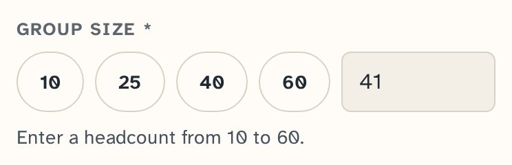
Confirmed in both retests. Silas found the exact-entry control unprompted; Sheila entered her exact headcount of 41 without hesitating.
02
Observation
Design response
After

Result
Confirmed. Silas specifically tested backward navigation at each step and it held.
“there's a back button here... every step of the way so that you can go back”
Silas, retest session
03
Observation
Design response
After

Result
Silas reached the request-received screen showing the point of contact.
Not yet confirmed: the hint for organizers with one specific date drew no comment in either retest.
Not yet confirmed: The Request received screen includes a sample post-event impact report, labeled as example data, showing the planned format for attendance, hours, output, and host feedback. Labeling the post-event report as sample data didn't come up in either retest.
06 · Final design
The responsive prototype makes opportunity details, availability, capacity, and next steps visible across individual, group, and returning-volunteer paths.
The finished experience
The first screen routes people by what they came to do instead of forcing every audience through one funnel.
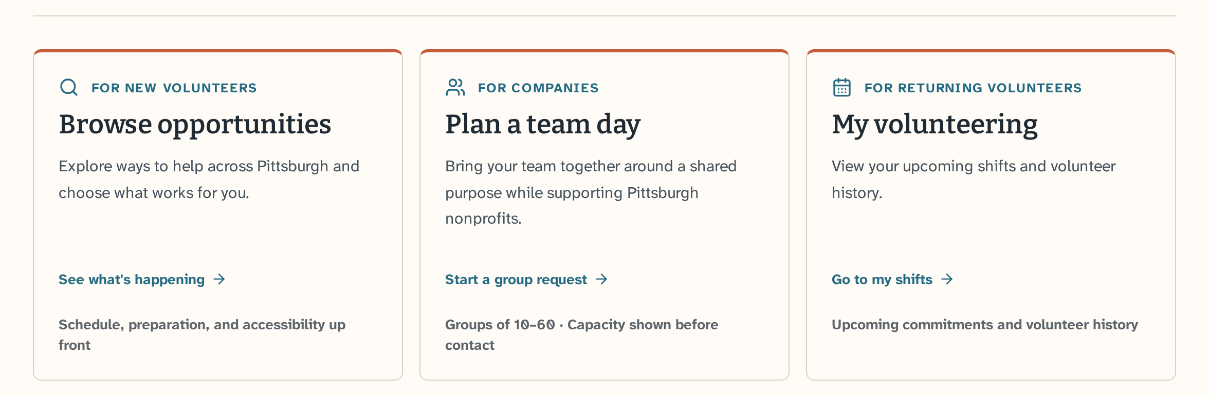
The homepage routes new volunteers to Browse opportunities, companies to Plan a team day, and returning volunteers to My volunteering, each with a short note on what to expect.
Path 1 · For new volunteers · Matt
A first-time volunteer finds an opportunity, reviews the commitment, and registers as a guest.
Step 1 of 3 · Browse
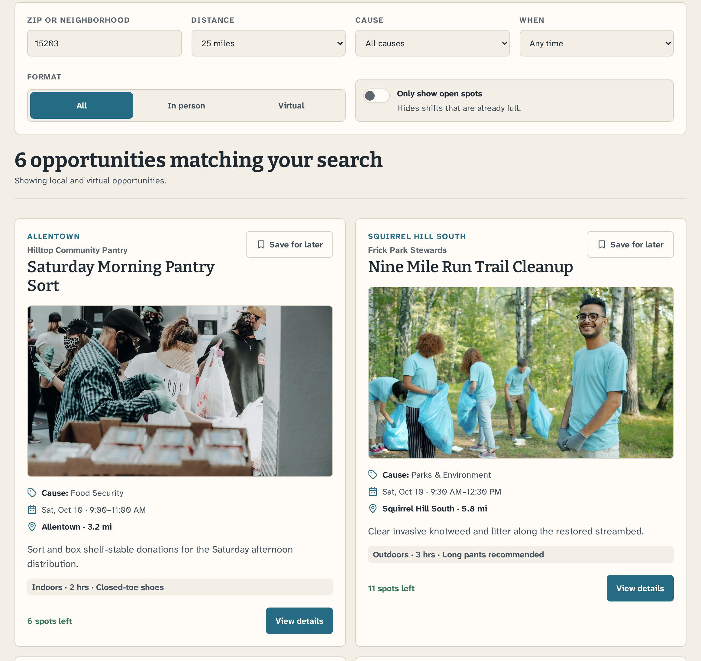
Six opportunities with filters up front
Filter by location, cause, date, format, and open spots.
Step 2 of 3 · Opportunity detail
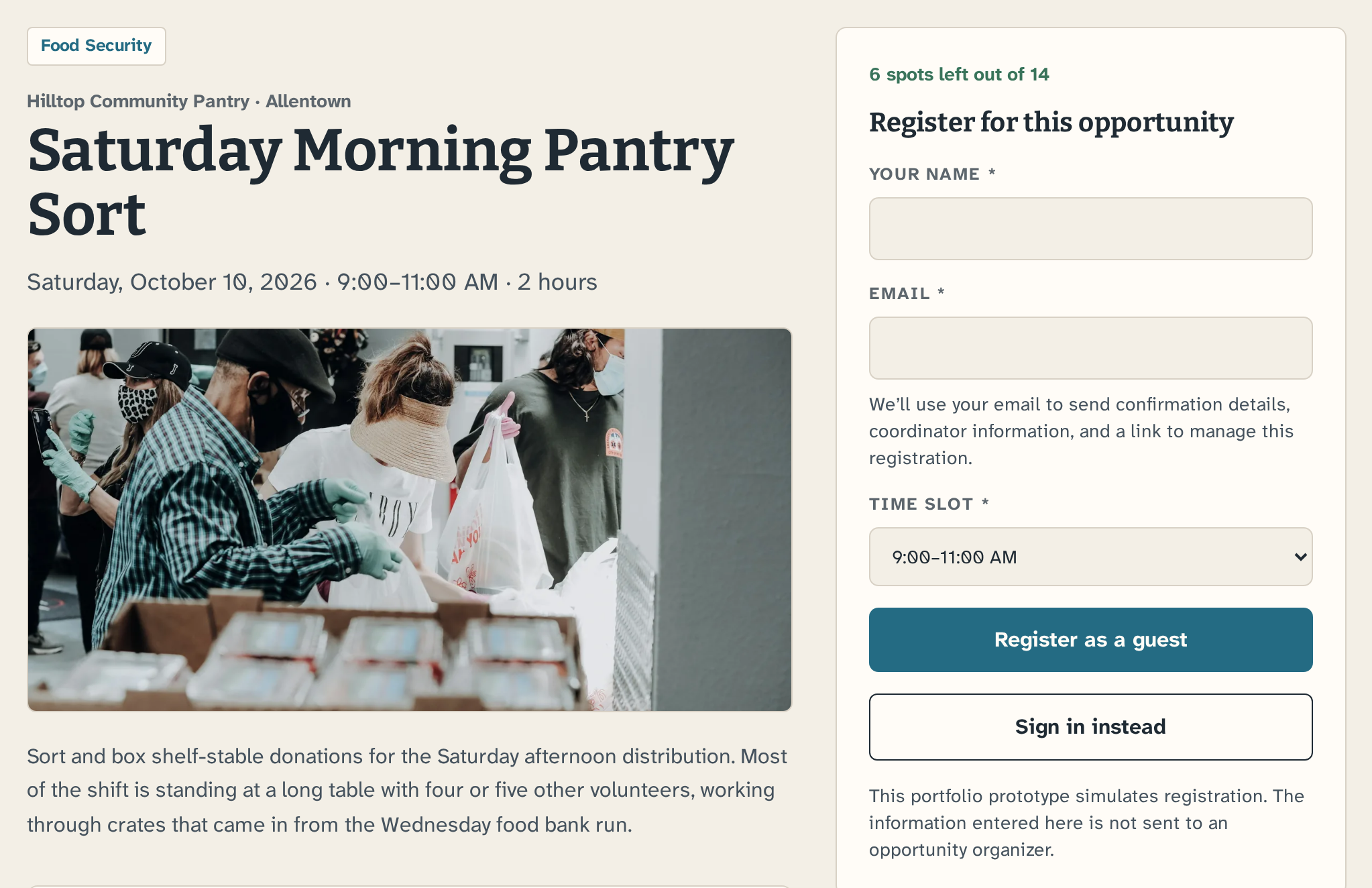
Details before the guest form
Expectations and access info sit beside a three-field form.
Step 3 of 3 · Confirmation
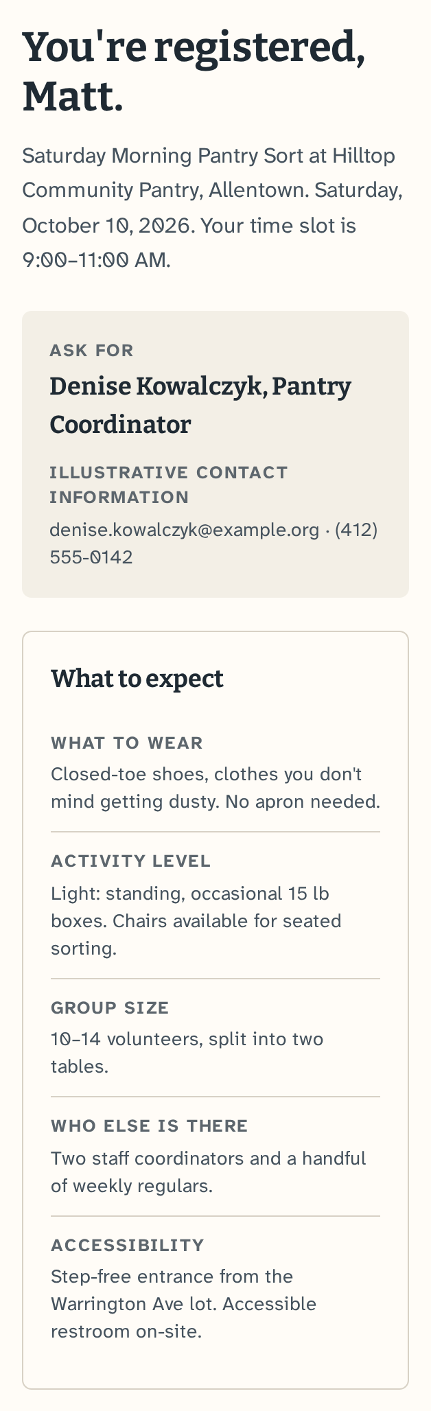
A phone-ready confirmation
Date, time, named contact, and what to expect, ready for check-in.
Path 2 · For companies · Brooke
Organizers see which hosts have room for their group before sharing contact details.
Step 1 of 3 · Your request
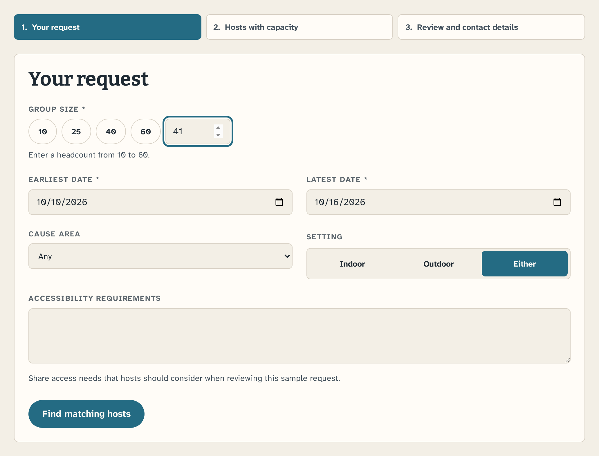
A request shaped around the group
Headcount, dates, cause, setting, and access needs.
Step 2 of 3 · Hosts with capacity
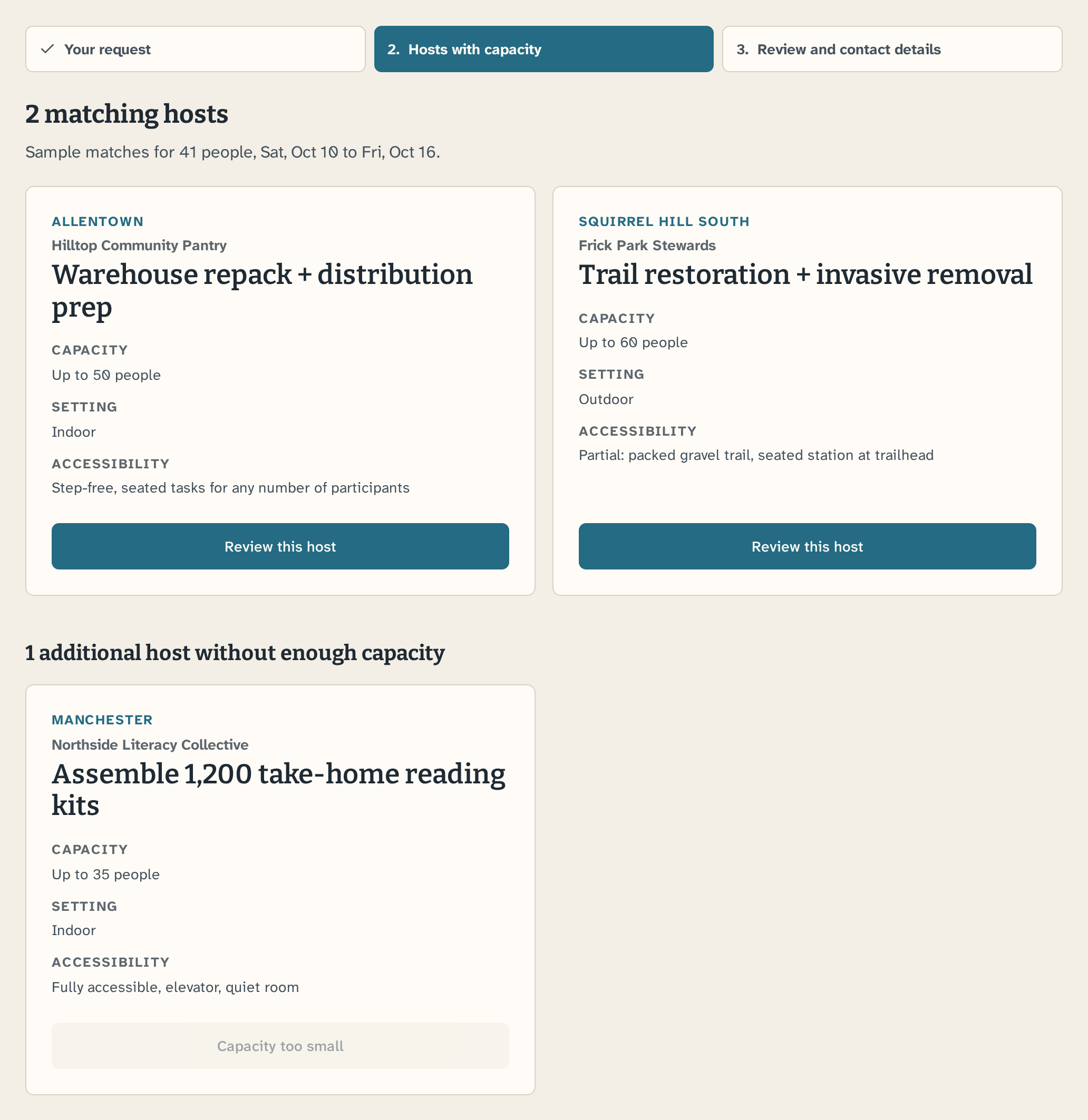
Capacity comes first
A host without enough room for the group sits apart from the matches.
Step 3 of 3 · Request received
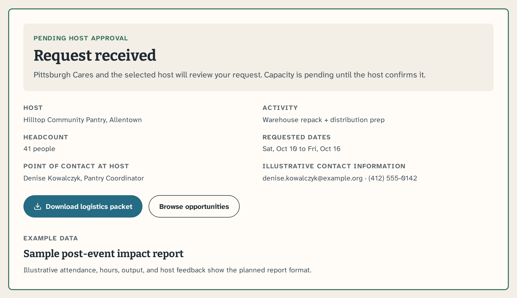
A clear pending state.
Capacity stays pending until the host approves, and a packet covers logistics.
Path 3 · For returning volunteers · Emma
Upcoming shifts
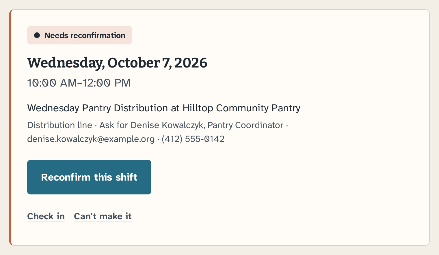
Shifts and hours in one place
Reconfirm, check in, or cancel from one card after an email-link handoff.
Live prototype
Try the browse, team-planning, and returning-volunteer paths after reviewing the evidence behind them.
Try the live prototypeThe live build uses shared blue and rust accents.
Core palette
Ink
#1F2A33
Ink Soft
#45525D
Background
#F3EFE6
Card
#FFFCF7
Line
#D8D1C5
Persona accents
Blue — shared interactive
#246B83
Rust — shared path accent
#C65D3A
Rust Soft
#F5E4DC
Warm Panel
#EEE8DC
Grey — shared
#5D666D
Semantic colors
Open / Confirmed
#39745B
Pain / Destructive
#B42318
Prototype typography
Bitter 600/700 for display text
Atkinson Hyperlegible Next 400/500/700 for body and interface text
Chosen for legibility, including its slashed zero, which keeps 0 and O distinct in dates and phone numbers.
Components
07 · Reflection
This project changed how I think about volunteer platforms: discovery matters, but the work of coordinating people, constraints, and expectations determines whether intent becomes participation.
01
A group organizer is solving for headcount, dates, logistics, and approval, not personal interest. Giving group coordination its own path from the start, instead of adapting an individual flow, is now a default for me.
02
Capacity, availability, accessibility, and a named contact shaped whether an organizer could proceed. I will surface those constraints at the comparison stage, before people invest time in forms or outreach.
03
Small details changed how the flow was understood: fixed headcount steps, back navigation, date wording, and the request status all created friction. I will test consequential labels and controls before polishing the broader experience.
Results are directional: five participants from a convenience sample, with two returning for the group-booking retest. The Testing section notes which changes aren't confirmed yet.
With another round, I would recruit corporate organizers who plan volunteer events, retest the two changes not yet confirmed, clarify why guests would need Sign in, and run a card sort before finalizing navigation labels.