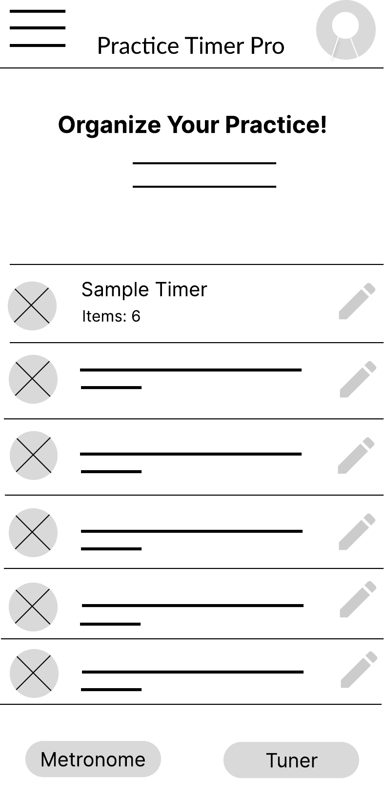
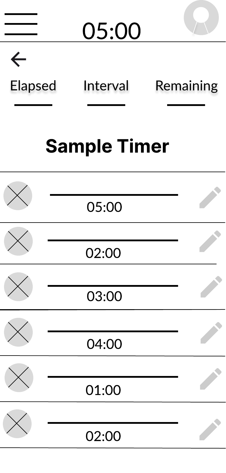
Reduce friction
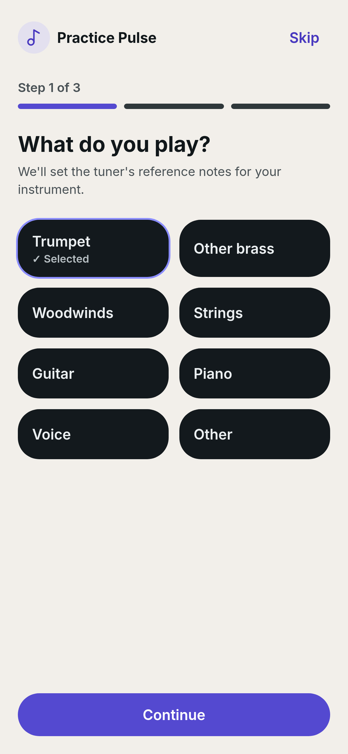
Getting started should take only a few seconds — no setup, no decisions, no menus in the way.
Practice Pulse
A mobile companion that reduces the friction of getting started — so musicians spend less time deciding to practice and more time actually practicing.

They struggle to do it consistently. As a professional trumpet player and university professor, I've watched skilled musicians — including myself — lose momentum not because we forgot how to practice, but because the ritual of starting slowly wore us down.
Existing practice apps lean on tools: metronomes, tuners, recorders. Useful features, but they treat practice as a task to configure rather than a habit to build. Practice Pulse takes the opposite bet — that the highest-leverage design problem in this space is helping musicians begin.
I combined my own lived experience as a working musician with discovery research: musician community discussions, competitor teardowns, and habit-formation product patterns from adjacent categories.
Recurring pain points
The pattern was clear: practice tools were built for the moment during practice, but the problem lives in the moment before it.
How might we help musicians reduce the friction of starting daily practice, so that consistency — not perfection — becomes the default outcome?
Design goals
Getting started should take only a few seconds — no setup, no decisions, no menus in the way.
Celebrate regular practice over total hours. Five short sessions beat one heroic Sunday.
Help users feel successful through achievable daily goals and calm, non-punitive feedback.
Remove complexity so attention stays on practicing — not on managing an app.
Every idea was tested against a single filter: does it help a musician begin practicing faster today than they did yesterday?
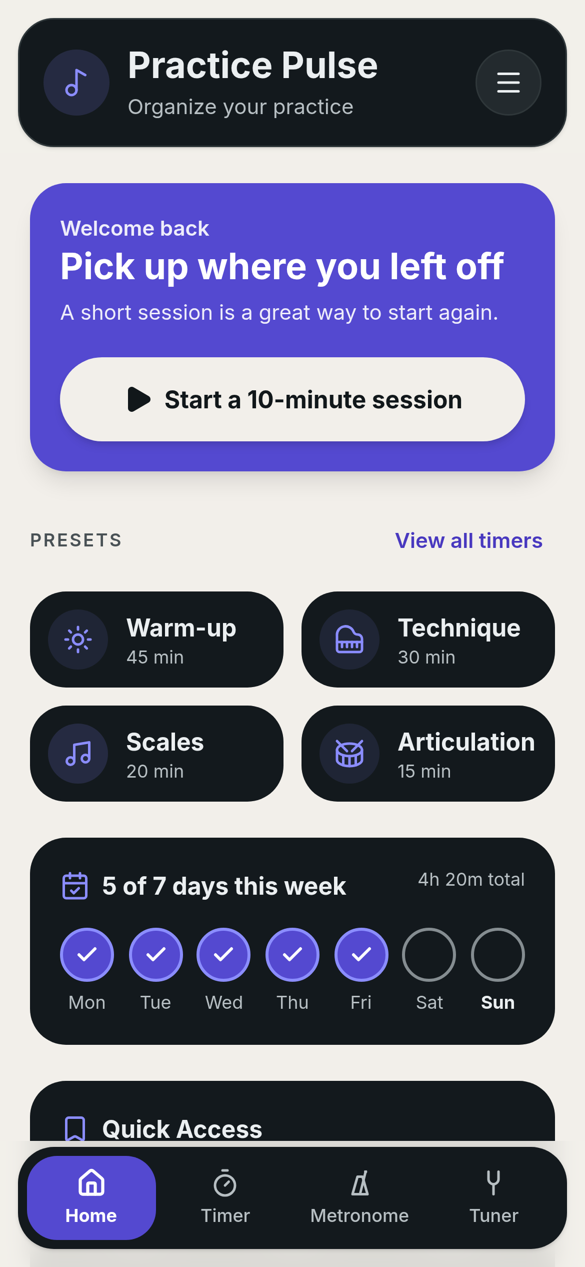
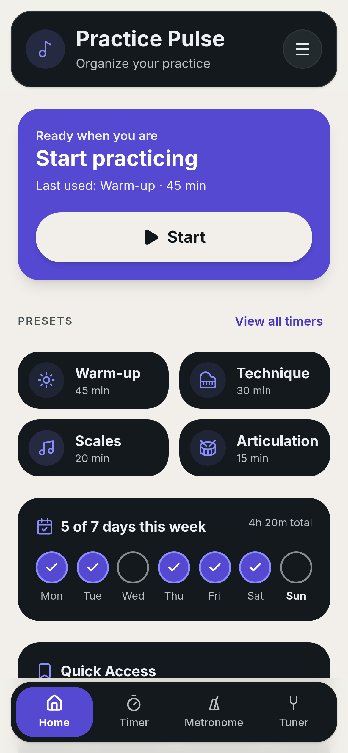
One tap launches a practice session from the home screen. No configuration required to begin.
Personal templates for warm-ups, etudes, and repertoire — reusable, editable, never mandatory.
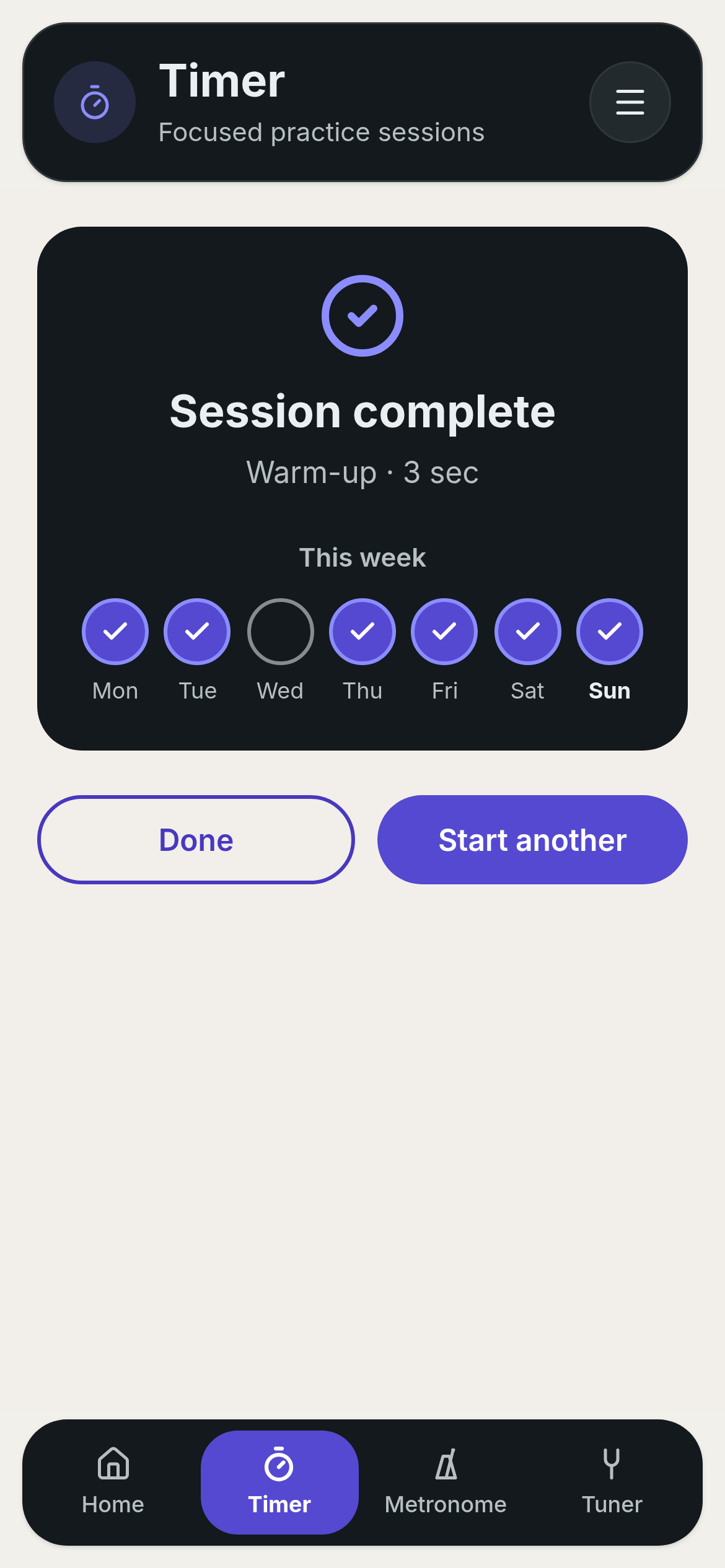
Consistency is rewarded, not hour counts. Missed days are acknowledged, not punished.
Simple visual indicators reinforce the pattern of showing up, week over week.
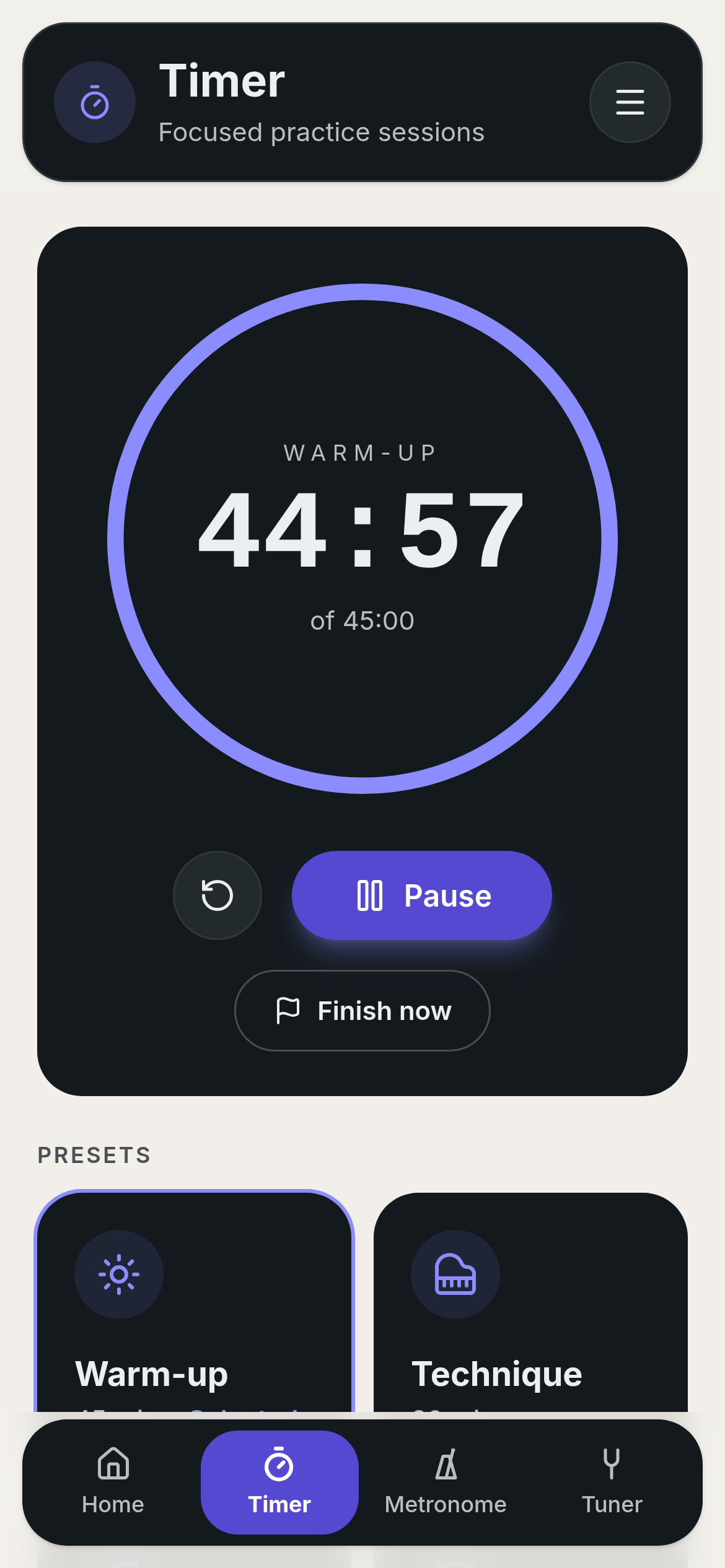
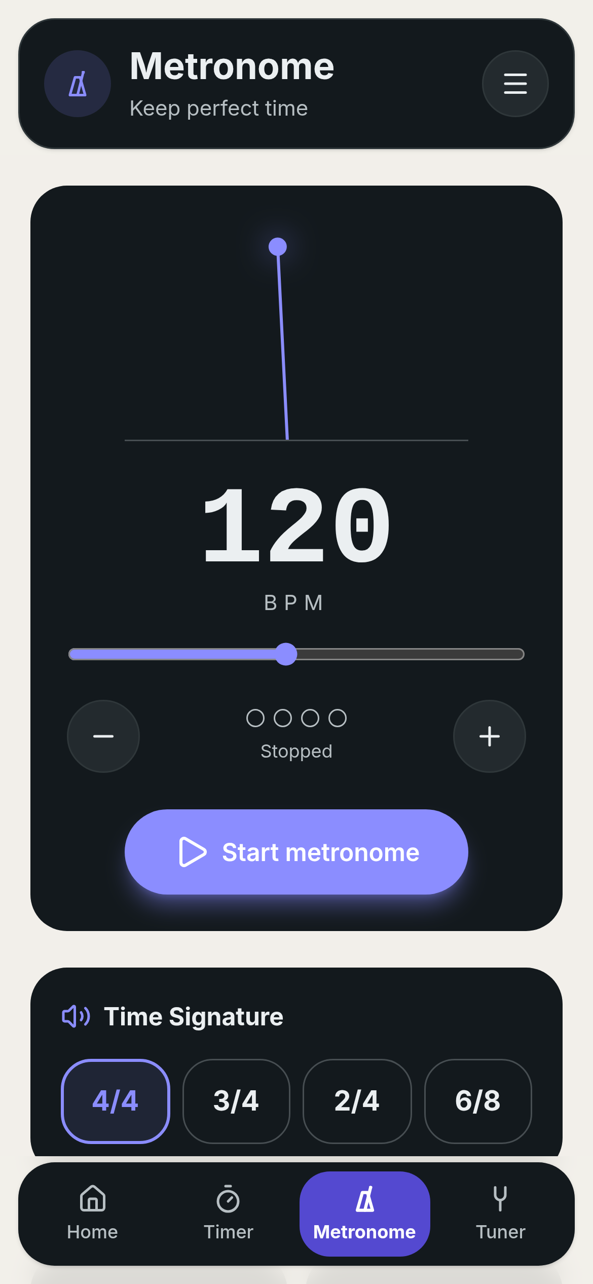
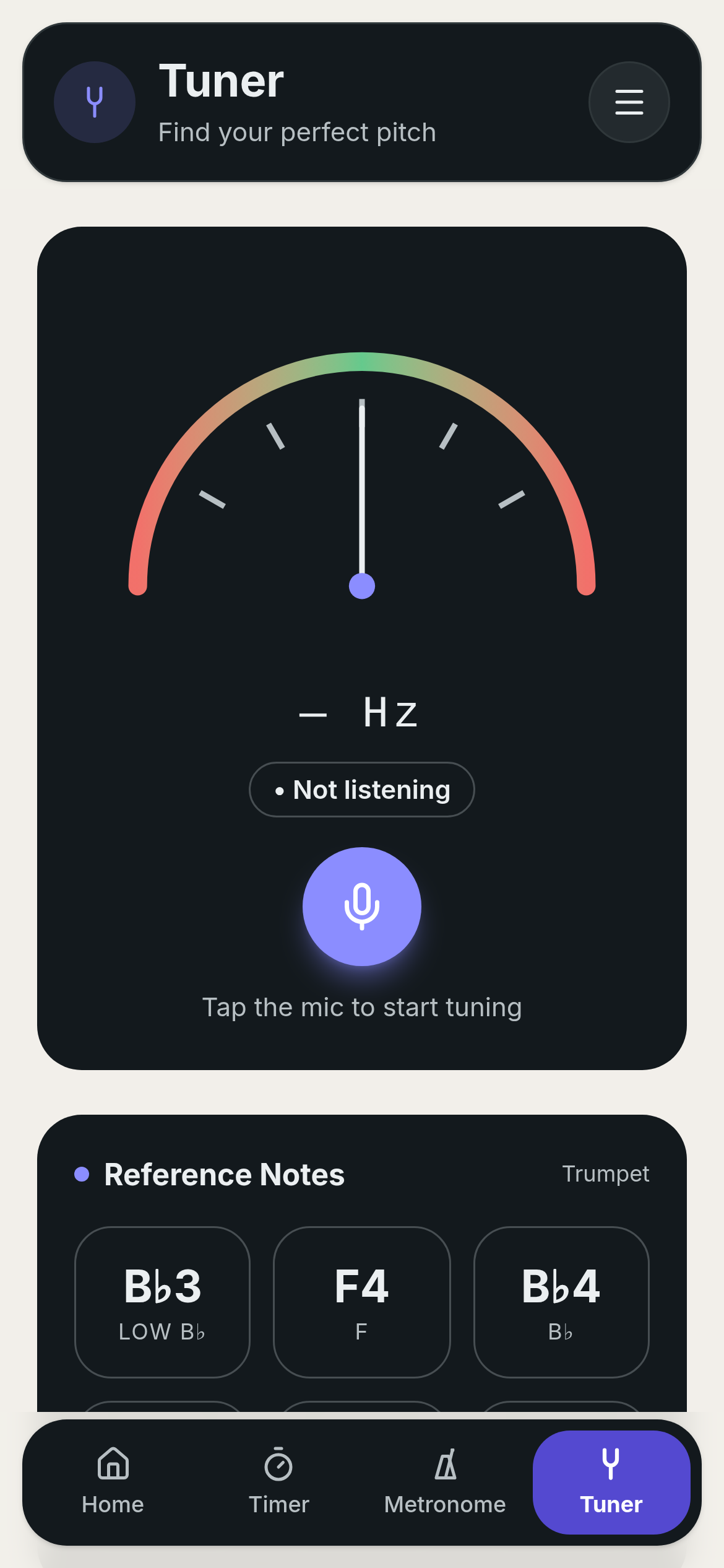
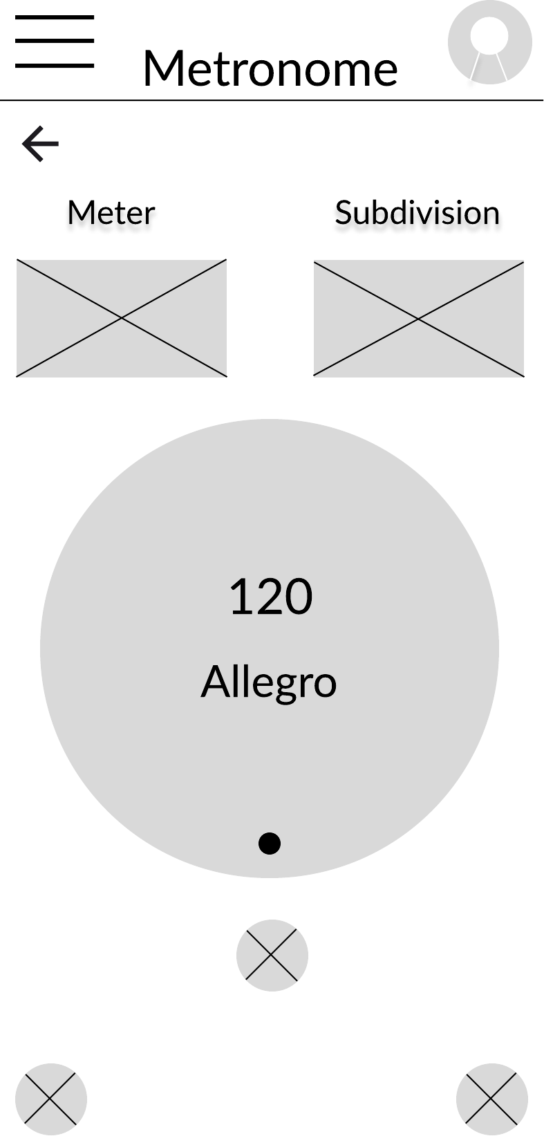
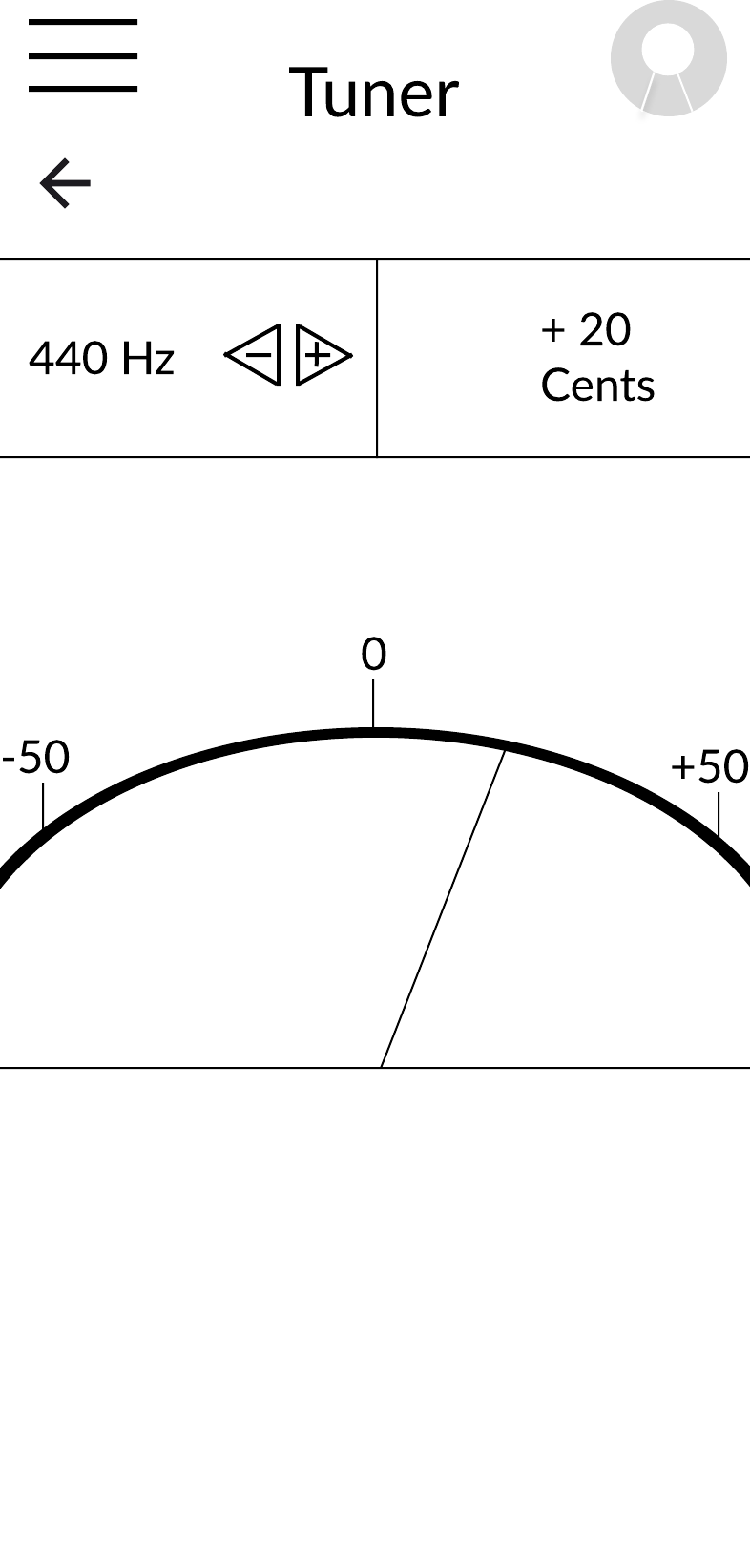
Metronome and tuner one tap deep so users never leave the practice context.
Information architecture
Five destinations, one primary action. The most common tasks stay within one or two taps; everything else lives progressively deeper.
The prototype was built in Figma with realistic interaction states, calm micro-animations, and the full onboarding-to-weekly-review flow wired end-to-end. Indigo carries the brand; teal signals progress and completion; whitespace does most of the emotional work.
Accessibility was in scope from the first frame — not a compliance pass at the end.
High-fidelity · Interactive · Mobile
Accessibility considerations
Moderated usability sessions with musicians across experience levels, followed by a planned small beta release. Success is measured with both qualitative feedback and behavioral analytics.
Primary research questions
The most useful moments in this project were the ones that failed in testing. Each setback pushed the product closer to the version musicians would actually keep on their phones.
What happened
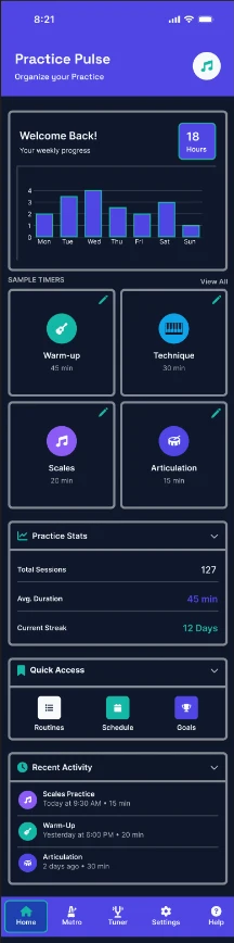
The first prototype opened on a monthly analytics view. Testers glanced at it, then tapped straight through to start practicing. The insights we spent the most time on were the ones users skipped.
What I learned
Musicians open the app to practice, not to review. Data belongs behind the doing, not in front of it.
How I adapted
Promoted a large 'Start Practice' action to the top of the home screen, with today's streak beside it. Analytics moved to a Weekly tab users visit intentionally.
What happened
An early copy pattern used red badges and 'Streak lost!' language after missed days. In testing, two participants said it made them want to delete the app rather than open it.
What I learned
For habit formation, missed-day copy is more important than good-day copy. Shame breaks the habit loop; grace repairs it.
How I adapted
Rewrote all lapse states to be neutral and forward-looking: 'Ready when you are — start a 10-minute session to pick things back up.' No red, no exclamation marks.
What happened
The first onboarding asked users to build a custom routine before their first practice session. Most abandoned mid-flow or created something they never used.
What I learned
Personalization is powerful, but it earns its place after users experience value — not before.
How I adapted
Shipped smart default routines (Warm-up · Technique · Repertoire · Cool-down) that users can practice immediately. Routine editing surfaces contextually after the third session.
Practice Pulse rewards the single behavior that predicts musical growth: consistency. Every surface is tuned so that the fastest path through the app is also the healthiest habit.
The home screen answers one question: are you practicing today? Everything else is one tap deeper — including the tools most competitors put on the front page.
Consistency is celebrated; lapses are met with a calm re-entry point, not a red badge. The tone is a supportive teacher, not a scoreboard.
A dedicated weekly dashboard translates sessions into visible momentum — the reward loop that keeps musicians coming back.
Custom routines, metronome, tuner, and settings live one level deeper. The primary surface stays calm because most users never need those tools first.
Practice Pulse is a concept prototype, but the MVP has clear success criteria. Each metric maps directly to the product's behavioral goal: helping musicians practice more consistently by making it easier to start and more rewarding to return.
Practice Pulse demonstrates my ability to design a complete mobile product — from identifying a user problem through interaction design, interface design, and product strategy — and to simplify complex behaviors into experiences that encourage consistency and reduce friction.
Every interaction was measured against one question: does this help someone begin practicing faster? That filter cut more screens than it added.
As a professional trumpet player, I knew the emotional shape of the problem. Research told me which parts of it actually needed solving in software.
The copy rewrite around missed days changed how testers felt about the app more than any visual change did. In behavior-change products, words are the product.
Practice Pulse is intentionally smaller than its competitors. That smallness is the point — it's why musicians can actually stick with it.
Interactive prototype