Case Study · Mobile · Personal Finance

Smart Budget

Turning monthly money stress into a calm, glanceable plan.

A mobile budgeting companion designed for first-time budgeters with irregular income — people who want to know if they can spend $40 on dinner tonight without opening a spreadsheet to find out.

Role
UX/UI Designer
Platform
iOS · Android
Discipline
Research · IA · Visual
Year
2025 — 2026

Walkthrough. Five minutes on the thinking behind the product.

01 · Context

The market is crowded. The pain is still unsolved.

There are dozens of personal finance apps. Most are built for one of two users: the spreadsheet-loving optimizer who wants every lever, or the affluent household coordinating shared accounts. Neither group is the largest underserved segment.

The underserved group is the first-time budgeter on irregular income — someone who has tried apps before, abandoned them, and now lives with a low-grade hum of financial anxiety. They don't need more features. They need fewer decisions and faster reassurance.

02 · Problem

People want financial control, not financial homework.

In our research, 73.9% of respondents identified as beginners at personal finance, and 39.1% were still tracking spend manually — in notes, memory, or not at all. Existing tools demand ongoing categorization, reconciliation, and weekly reviews that beginners can't sustain.

How might we help a first-time budgeter with irregular income answer one question every day — “can I spend this?” — without requiring weekly maintenance to keep the answer accurate?

03 · Approach

We started by listening.

A 10-question survey, a mixed-method audit of three incumbents, one synthesized primary persona, and a ruthless filter on every feature: does this earn its place for Alex?

  • 73.9%

    Self-identified as beginners at personal finance

  • 39.1%

    Track spending manually — notes or memory

  • 30.4%

    Already use a dedicated budgeting app

  • 8.7%

    Don't actively budget at all

01

Cognitive load is the enemy

Why it matters

Beginners abandon tools that demand constant categorization. If the first surface looks like a spreadsheet, they're gone.

Design decision

Lead with one glanceable answer (can I spend this?) — push categorization, filtering, and reports one level deeper.

02

Anxiety lives in the unknowns

Why it matters

Stress comes from surprise — a charge you forgot, a balance you didn't expect. Passive dashboards don't help; they require the user to remember to look.

Design decision

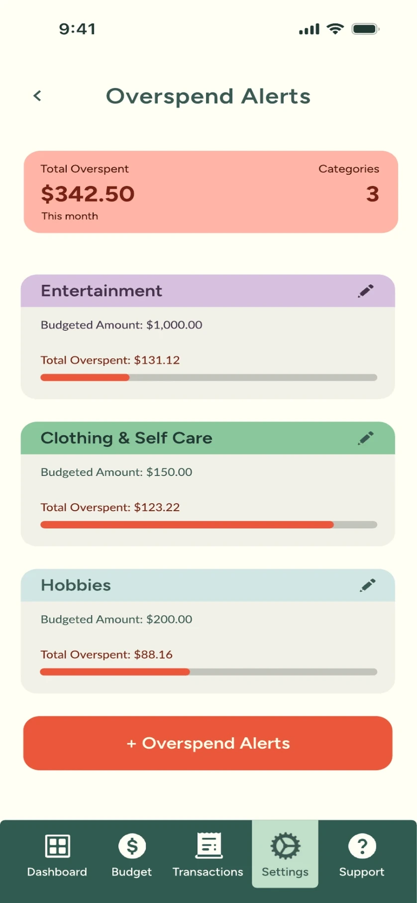
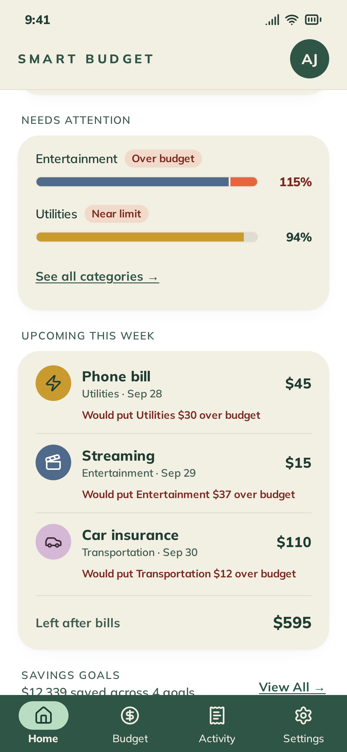
Bias the system toward proactive alerts (upcoming bills, category thresholds) over passive reporting.

03

Plan vs. activity are different mental models

Why it matters

In testing, users conflated 'I budgeted $400 for groceries' with 'I spent $312 on groceries.' Two different jobs, two different surfaces.

Design decision

Hard separation between Transactions (history) and Budgets (planning) — same vocabulary, different verbs.

04

Reuse the same categories everywhere

Why it matters

Inconsistent categories between screens force users to re-learn the app on every tab. That's a tax on confidence.

Design decision

One canonical category set across Dashboard, Transactions, and Budgets. Filter once, see it everywhere.

Competitive audit

Three incumbents. Three different trade-offs. One unserved middle.

Rocket Money

Automation-heavy subscription tracker

Strong at surfacing recurring spend. Weak at forward-looking weekly planning for irregular income.

Monarch Money

Premium household finance platform

Best-in-class for couples and shared accounts. Onboarding is heavy — wrong fit for our target user.

PocketMoney

Lightweight manual tracker

Fast to log a transaction. Missing the proactive guidance that turns logging into actual behavior change.

Primary persona

Designing for Alex, not for everyone.

Alex

Age 28

X-Ray Technician · Houston, TX

Hourly + shift differentials — paycheck varies $400–$900 every two weeks

I want to know where my money is going without spending Sunday night on a spreadsheet.
Context
  • First-time budgeter. Has tried two apps; abandoned both within a month.
  • Irregular income, predictable bills — the gap is where anxiety lives.
  • Checks her bank app 4–6× per day, mostly to confirm she's not overdrawn.
Needs
  • A single number that answers 'can I spend this?'
  • Heads-up before bills hit, not after
  • Zero tolerance for setup that takes more than ten minutes
04 · Setbacks

Three things that didn't work — and what they taught me.

The shortest path to a good product runs through several bad ones. These were the most useful failures.

  1. Setback 01

    V1 onboarding asked for too much, too soon

    What happened

    The first prototype asked users to link a bank, set 8 category budgets, and create savings goals before they saw a single screen of value. In moderated testing, 4 of 6 participants stalled at the budget step.

    What I learned

    Onboarding is a value transaction, not a configuration form. Users won't pay setup costs for a product they haven't experienced yet.

    How I adapted

    Re-sequenced onboarding to deliver the dashboard in under 60 seconds with smart defaults. Budgets became an optional 'tune later' step surfaced contextually after the first week of data.

  2. Setback 02

    The first dashboard buried the one thing users actually wanted

    What happened

    The initial layout led with a monthly spend chart and a savings progress ring. Users glanced at it, then immediately tapped through to their account balance — every time.

    What I learned

    We had designed for the planner persona's mental model, not the daily-check persona's. The chart was beautiful and ignored.

    How I adapted

    Promoted 'Safe-to-spend today' to the top of the dashboard as a single large number. Charts moved down. Tap-throughs dropped because the answer was already on screen.

  3. Setback 03

    Alerts were either ignored or rage-quit

    What happened

    Early alerts copy was either too generic ('Budget update') or too aggressive ('You've overspent!'). One tester turned all notifications off after two days.

    What I learned

    Alert tone is part of the UX. Financial anxiety is real — alarming copy creates the exact feeling the product is supposed to relieve.

    How I adapted

    Rewrote every alert to be specific, calm, and actionable: 'Groceries is at 80% with 9 days left — here's what's left to spend.' Added a one-tap snooze and a clear settings path.

05 · Solution

Four pillars.
One mental model.

Every screen earns its place against Alex's daily question. Same vocabulary, same colors, same hierarchy — learn one surface, you've learned the app.

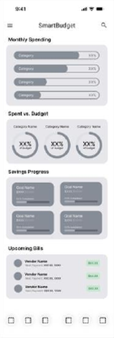
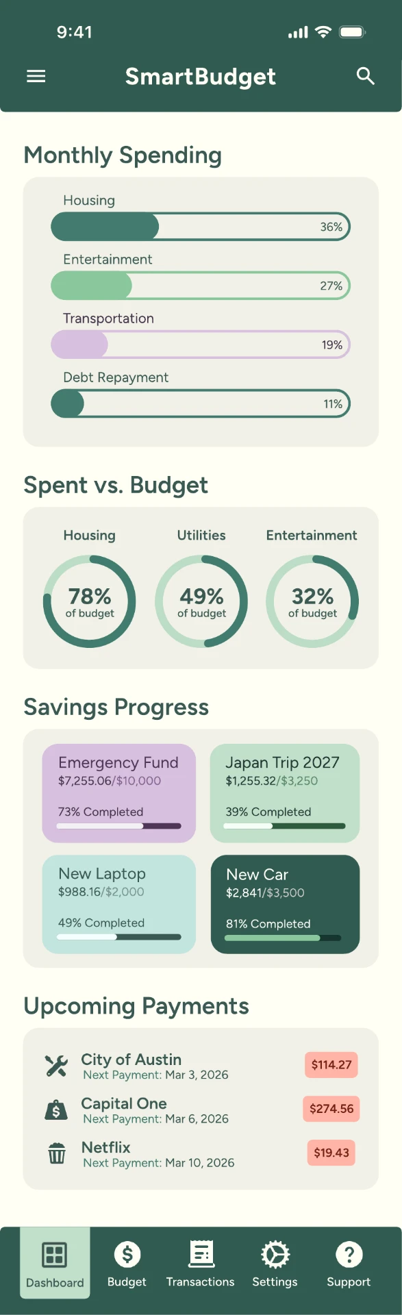
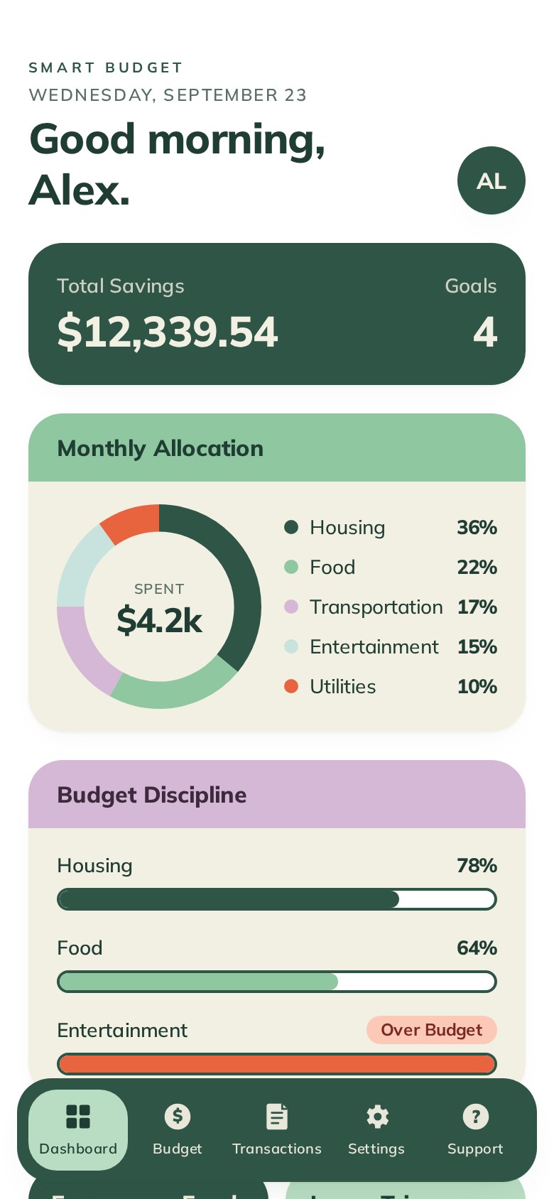
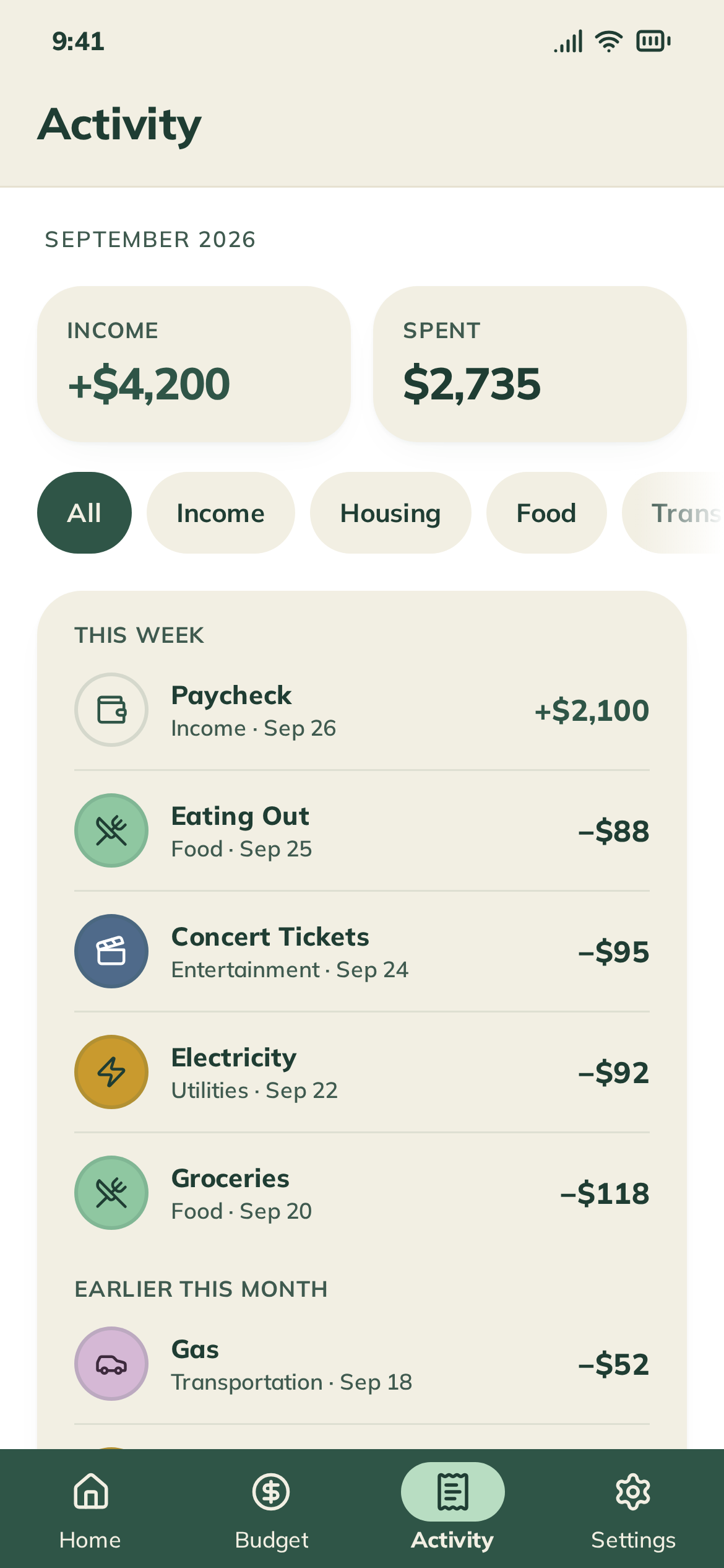
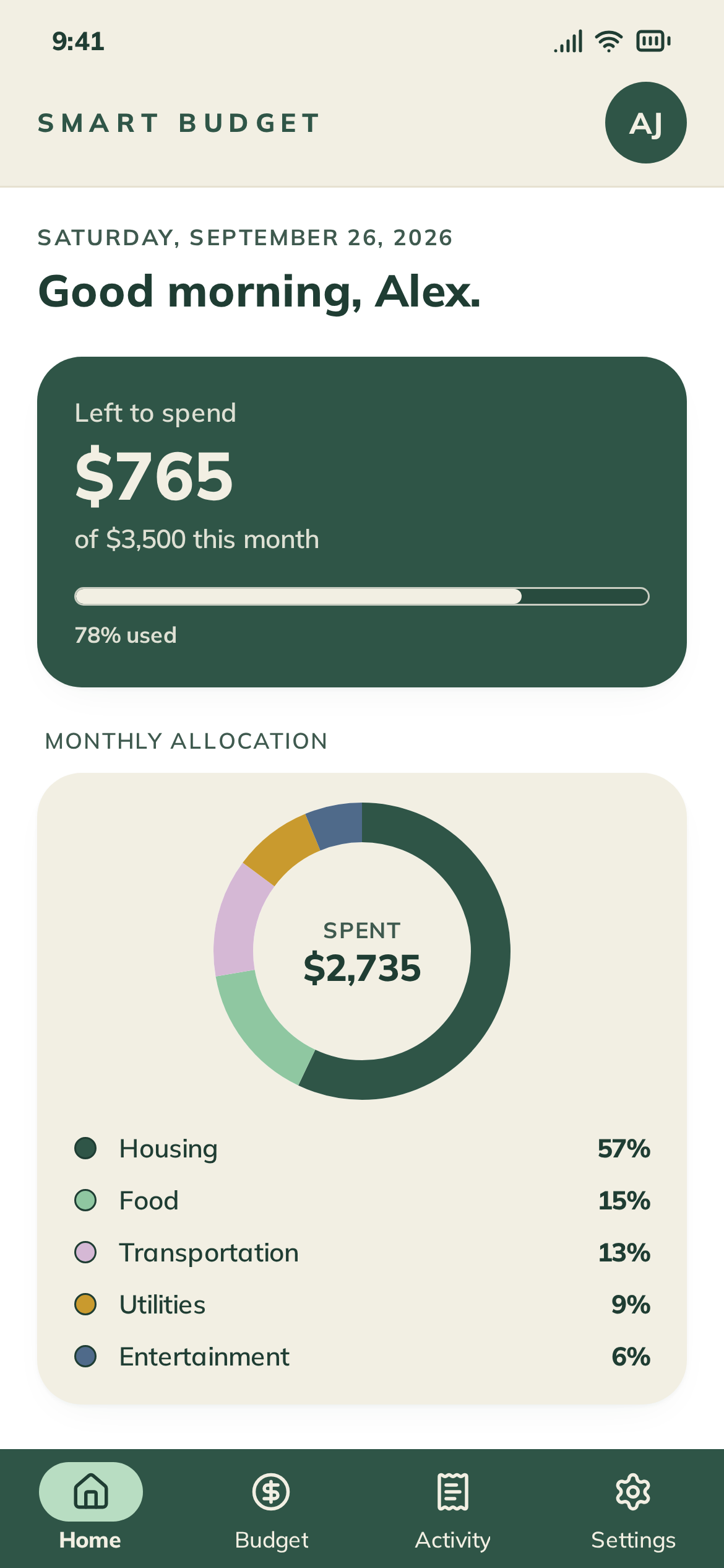
Smart Budget mobile dashboard
  1. 01

    Safe-to-spend, front and center

    The dashboard answers the one daily question with a single number, in the largest type on the screen. Everything else is supporting evidence.

  2. 02

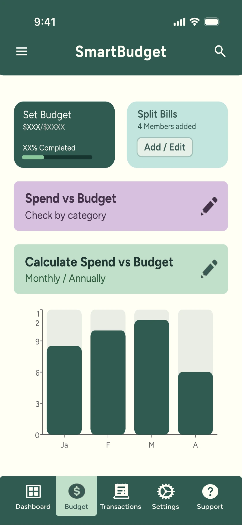
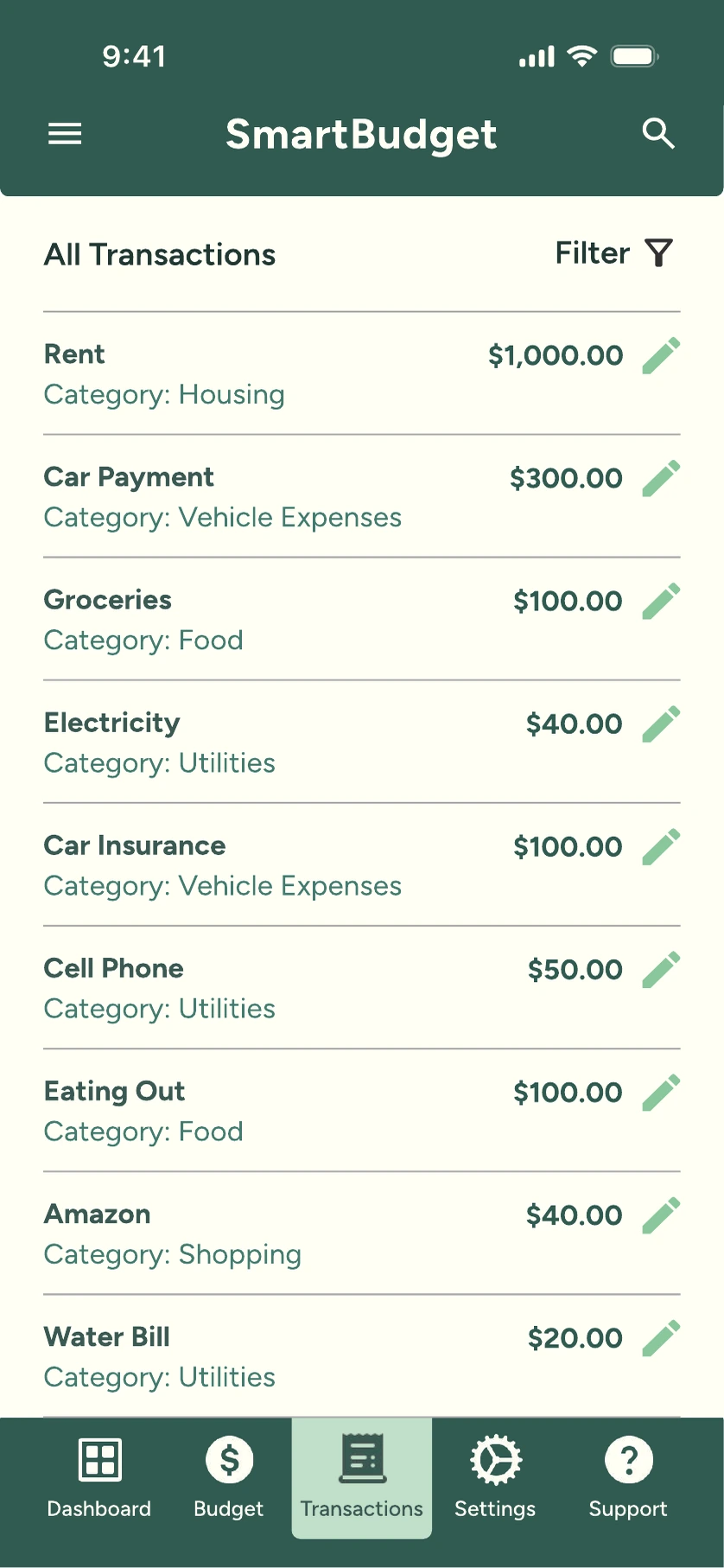
    Planning and tracking, deliberately separated

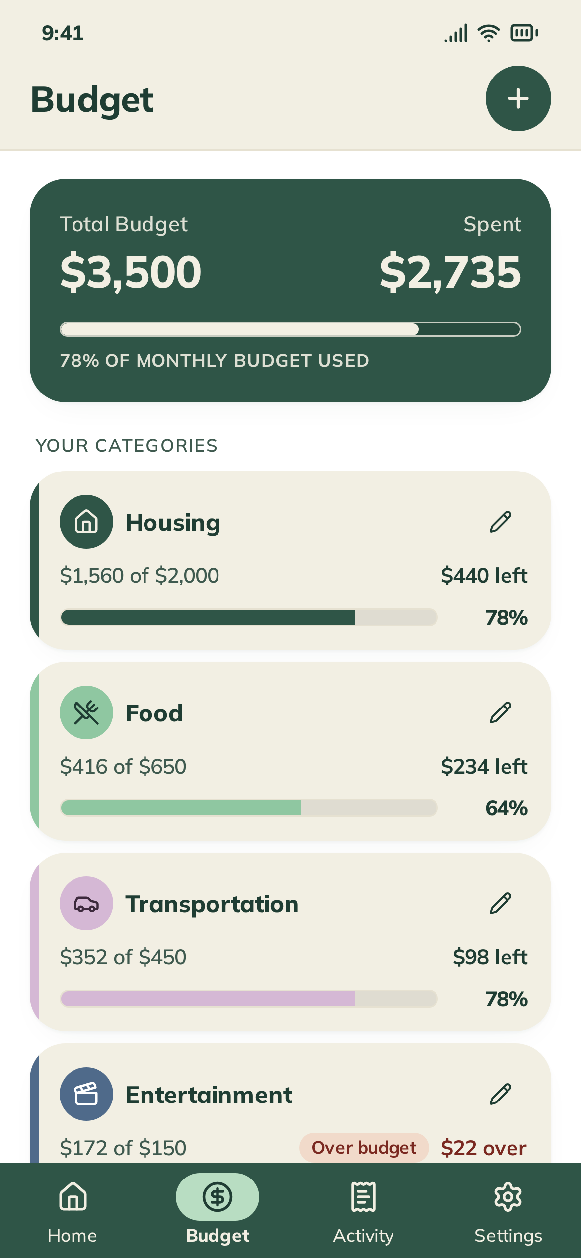
    Budgets is a planning surface. Transactions is a ledger. They share categories and colors, but never share verbs — you plan in one, you review in the other.

  3. 03

    Proactive alerts with a human voice

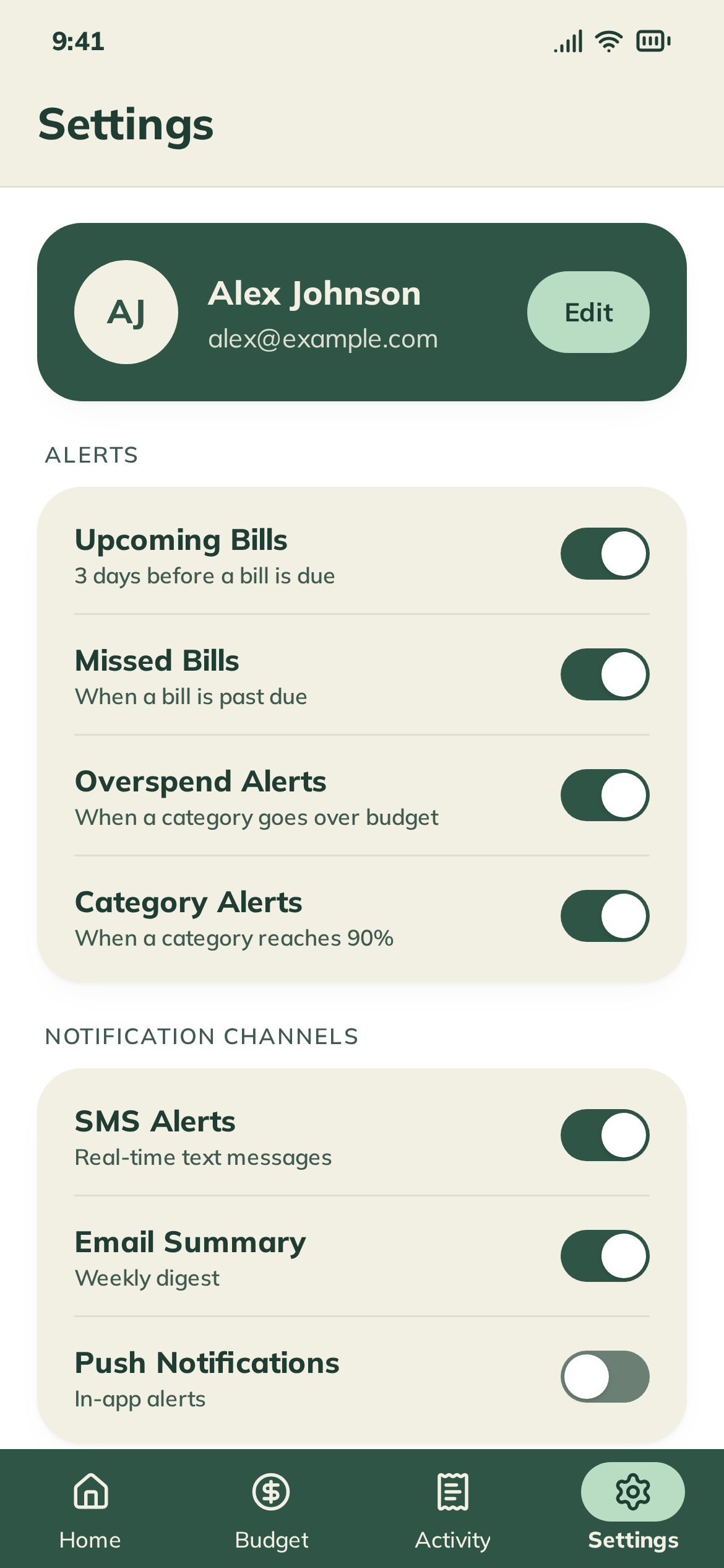
    Notifications arrive before money becomes a problem and read like a thoughtful friend, not a bank statement. Every alert is snoozable, dismissible, and explains itself.

  4. 04

    Progressive disclosure throughout

    Split Bills, custom alert thresholds, and advanced security live one tap deeper. The primary nav stays calm because most users never need them on day one.

06 · Results

Measured against the job the user came to do.

Smart Budget is a portfolio project, so these results come from moderated usability testing, not production analytics. Every number below is tied to a specific design decision earlier in this case study.

  • 60s

    Time-to-first-dashboard in revised onboarding (from 4+ minutes)

  • 4 → 1

    Taps to answer 'can I spend this?' after the dashboard redesign

  • 5/5

    Testers correctly distinguished Budget from Transactions after the IA split

  • 0

    Notifications disabled by testers after the alert-tone rewrite

07 · Learnings

What I'd carry into the next project.

01

Lived adjacency matters — but isn't enough

I'm not Alex, but I've lived irregular income as a working musician. That gave me empathy for the anxiety, not the answer. The answer came from listening to her, not assuming I already understood.

02

Restraint is a feature

Every screen I cut made the remaining screens stronger. The hardest design decisions on this project were about what not to ship.

03

Tone is UX

The alert rewrite changed retention more than any layout change. In a finance product, the words on the screen are the product.

04

Setbacks compound into clarity

Each failed prototype sharpened the thesis. By the third iteration, the product wasn't 'a budgeting app' — it was 'a calmer relationship with money,' and the IA followed from there.

Try it

A calmer relationship with money, one glanceable screen at a time.